Black Bolder: A Joyful Display Font for Digital Branding
I was halfway through refining the hero section of a boutique coaching site when I paused—again—to test Black Bolder. Not as a placeholder, but as the real headline font. The client wanted “warmth with intention,” something that felt both grounded and uplifting. So I swapped in Black Bolder over the existing sans serif, adjusted letter spacing by 2px, and watched how it settled into the layout: clean, confident, quietly joyful. That’s when it clicked—not just that it looked right, but that it behaved right across devices, contexts, and brand moments.
A Display Font That Carries Emotional Weight
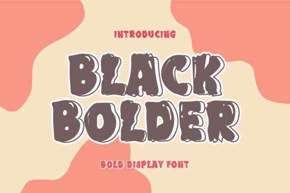
Black Bolder is a premium display font—designed not for paragraphs, but for presence. Its structure is elegant yet approachable: generous x-height, soft curves, balanced contrast, and subtle terminal flares that add sweetness without sacrificing clarity. It’s not ornate or fussy, and it’s certainly not cold or corporate. Instead, it lands somewhere between modern editorial design and heartfelt handmade charm—a rare sweet spot for digital branding.
What makes it especially effective on screen is its intentional openness. Characters breathe. Spacing feels generous even at smaller display sizes (think 32–48px on desktop, 28–36px on mobile), and the weight holds up beautifully against image overlays or gradient backgrounds. I tested it over a muted linen texture in a course sales page banner—and instead of competing, it anchored the visual hierarchy with calm authority.
How It Performs in Real Web Layouts
In practice, Black Bolder shines where attention needs to land: hero headlines, section titles, CTA buttons (when sized appropriately), and branded quote blocks. On a portfolio homepage, I used it for the tagline—“Design with purpose, create with joy”—and paired it with a neutral, highly legible sans serif (Inter, set at 18px/1.6 line height) for body copy. The contrast worked instantly: Black Bolder gave voice; the body font gave clarity.
It also performed well in responsive contexts. At 24px on mobile, it remained scannable in section headers—no blurring, no awkward kerning collapse. I did notice slight tightening in all-caps usage below 20px, so I reserved that treatment for larger, high-impact moments only (like a campaign landing page subhead). For buttons, I kept it at 16–18px with modest tracking (+20–30) and always ensured sufficient color contrast (tested with axe DevTools)—it passed WCAG AA comfortably against light and dark backgrounds alike.
Where It Fits—and Where It Doesn’t—in Digital Design
Black Bolder isn’t built for utility. It’s not meant for navigation menus, form labels, data tables, or dense dashboard interfaces. Its personality is too distinct for those roles—and rightly so. Using it there would undermine both usability and its own strength: emotional resonance.
Similarly, avoid long-form body text. Even at optimal sizes, its decorative rhythm slows reading velocity. Stick to short, high-value phrases: welcome messages, value propositions, testimonial highlights, product names, or campaign slogans. Think “Your First Step Starts Here” rather than “Click here to begin your free 14-day trial.”
That said, it adds remarkable polish to digital printables and downloadable assets—like branded worksheet headers, course module titles, or preview thumbnails for Canva templates. When embedded in SVGs or exported as crisp PNGs for social media banners, it retains its elegance without hinting at rendering quirks.
Smart Pairings & Practical Considerations
Pairing is where Black Bolder truly unlocks versatility. With a clean, humanist sans serif (like Inter, Poppins, or Manrope), it creates warmth without clutter. With a gentle serif (such as Cormorant Garamond or Literata), it leans into editorial sophistication—ideal for blog headers or newsletter subject lines. Avoid pairing it with other decorative fonts unless you’re intentionally building layered typographic storytelling (e.g., Black Bolder for the title + a delicate script for an accent word).
Before integrating it into a live site, I always check three things: webfont availability (WOFF2 preferred), included weights (Black Bolder comes with one strong, versatile weight—perfect for display use), and commercial licensing. Since it’s a display font, make sure your license covers web embedding, especially if you’re using it in client work, SaaS dashboards, or online course platforms. Also verify multilingual support if your audience spans languages beyond basic Latin—some accents render cleanly; others may need fallback handling.
A Thoughtful Tool for Intentional Brands
What sets Black Bolder apart isn’t just how it looks—it’s how it supports intentionality. In a world of generic system fonts and overused Google Fonts, choosing Black Bolder signals care. It tells visitors: this brand values craft, emotion, and clarity—not just speed or scalability. I’ve seen it soften the tone of a tech-adjacent service page, elevate the perceived value of a digital template shop, and bring cohesion to a seasonal campaign across email, web, and social previews.
It won’t solve UX problems on its own—but when placed thoughtfully, with attention to spacing, contrast, and context, Black Bolder becomes part of the solution. It’s the kind of display font that doesn’t shout, but still makes you pause. And in digital design, that pause is often where connection begins.