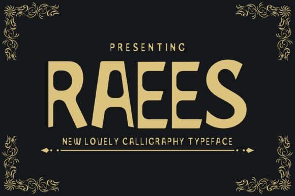
Raees: A Display Font That Elevates Digital Branding
Two days ago, I was finalizing the hero section of a new landing page for a ceramicist’s online studio—clean layout, warm photography, handcrafted aesthetic. The headline needed to feel intentional but not stiff, artistic but still legible at a glance. I opened my font library and typed “Raees” into the search bar. Instantly, it stood out—not because it shouted, but because it breathed. That’s how I first experienced Raees: as a display font with quiet confidence.
Raees is a beautifully balanced display typeface—elegant without being ornate, contemporary without losing warmth. Its letterforms have subtle contrast, gentle curves, and just enough personality to signal creativity and care. It’s not a script or handwritten font, nor is it a rigid geometric sans. Instead, Raees occupies that thoughtful middle ground: refined enough for editorial layouts, expressive enough for visual storytelling, and versatile enough to anchor a digital brand identity.
In practice, I used Raees for the main headline (“Handmade Ceramics, Thoughtfully Made”) and the subheading (“Studio collections • Workshops • Custom commissions”). On desktop, it held its own over a soft-focus image background—no stroke, no shadow, just clean weight and generous spacing. On mobile, I adjusted the line-height and reduced tracking slightly, and it remained legible even at 28px. That’s rare for a display font: many lose clarity on smaller screens, but Raees scales gracefully when paired with thoughtful responsive typography.
What makes Raees especially useful for web designers is its intentionality. It’s not meant for body copy—and shouldn’t be. But as a display font, it excels where impact matters most: hero titles, section headers, call-to-action banners, product name tags, course launch headlines, and portfolio project labels. I’ve also used it sparingly in blog post graphics (exported as SVG), email header images, and branded social media carousels—always as a focal point, never as filler.
Readability isn’t just about size or contrast—it’s about rhythm and recognition. Raees supports quick scanning because its letter shapes are distinct yet familiar. The ‘a’, ‘e’, and ‘s’ have graceful openings; the uppercase ‘R’ has a confident stance. On light backgrounds, it shines with minimal styling. Over darker or textured imagery, I added a soft 1–2px white text shadow—just enough to lift it without compromising elegance. No heavy outlines, no fill adjustments needed.
Font pairing is where Raees really sings. In this same project, I paired it with Inter for all body copy, navigation, and buttons. Inter’s neutral clarity creates breathing room for Raees to lead. For a more editorial or luxury-leaning site, I’d consider pairing Raees with a refined serif like IBM Plex Serif or Charter—especially for blog headers or newsletter subject lines. The key is contrast: let Raees carry voice and character, while your secondary font handles function and flow.
Before deploying Raees live, I checked what was included: four weights (Light, Regular, Medium, Bold) plus matching italics, full Latin character support, and OpenType features like ligatures and stylistic alternates. All available as WOFF2 files—lightweight, fast-loading, and compatible across modern browsers. No missing glyphs mid-sentence. No surprise rendering issues in Safari or Firefox. And yes—I confirmed the commercial license covers web use, client projects, and digital templates. (Always worth double-checking, especially when sourcing fonts outside major marketplaces.)
One thing I appreciated during testing: Raees doesn’t demand attention—it invites it. That’s valuable in an age of scrolling fatigue. On a coaching website homepage, it gave warmth to a “Start Your Journey” headline without sounding salesy. On a boutique online store banner, it elevated a seasonal collection title (“Summer Edit”) with sophistication, not stiffness. And on a course sales page, it helped distinguish module titles from supporting descriptions—creating hierarchy without relying solely on size or color.
That said, Raees isn’t for every element. I wouldn’t use it for navigation links, form labels, or small CTAs under 16px. It’s not built for dense paragraphs or rapid scanning of feature lists. Its strength lies in moments of emphasis—where you want the user to pause, recognize tone, and connect emotionally before reading further. Think of it as your brand’s signature gesture: deliberate, memorable, human.
For designers building digital brand kits, Raees fits naturally alongside other design assets—logos, color palettes, icon sets. It adds typographic distinction without requiring custom illustration or animation. In Figma, I applied it to component variants for “Hero Title”, “Section Header”, and “Featured Quote”—then documented usage guidelines: minimum size, ideal pairings, and contrast ratios for accessibility compliance.
If you're evaluating Raees for your next project, ask yourself: Where does your brand need to say something meaningful in few words? Where do users land first—and what impression should that make? Raees answers those questions with grace, not gimmick. It’s not flashy—but it’s unmistakably present. And in digital design, presence—calm, considered, consistent—is often the strongest signal of professionalism.
It’s now part of my go-to display font rotation alongside a few others—but Raees is the one I reach for when the brief says “timeless, not trendy” or “creative, but credible.” Whether you’re designing a portfolio, launching a course, refreshing a blog header, or building a campaign landing page, Raees offers a rare balance: expressive enough to stand out, restrained enough to belong.
- Best for: Hero headlines, section titles, logo lockups, social graphics, email headers
- Avoid for: Body copy, small interface text, data-dense tables, long navigation menus
- Pair with: A highly legible sans serif (e.g., Inter, Manrope, Poppins) or a classic serif (e.g., Charter, IBM Plex Serif)
- Check before use: Webfont formats (WOFF2 recommended), licensing scope, language support, and responsive behavior at 320px–480px widths